Why Percentages?
Over the course of the last four years, I’ve gained a lot of respect for percent-based layouts. They provide a high level of flexibility while maintaining cross device / cross-browser cohesiveness. The main goal of a percent layout is to eliminate static pixel values from your code whenever possible and replace those static numbers with percentages. It’s easier said than done, but the finished product tends to be much stronger.
From a developer perspective, it’s a change of pace from what you might be used to. A lot of teams focus on the idea of “Pixel Perfect”, meaning using hard values for width and height of all elements. I like to focus on Percent Perfect.. You can still build a site using percents and have it match comps, but ultimately this works best with collaboration between design and development. Creating designs built in this way can go a long way in saving time down the line when deploying to different sized devices. Most likely this approach will be used for mobile / tablet styling with media queries to change percentages values to favor traditional the desktop design and user experience.
Coding Basics
For a new web standards developer, understanding the overall concepts of width and height percentages can be a bit daunting. The most important thing to keep in mind while using percentages is to keep track of your math and have a good understanding of your intended layout.
Let’s get started with a simple example and work our way up. Below will be our HTML source throughout the examples. We’ll only be modifying the CSS from here.
<h1 id="site-title">Main Title</h1>
<section id="container-info">
<h1>Info Title</h1>
   <div>
      <p>Info paragraph</p>
      <a href="”http://blog.adamjacaruso.com”">Info Link</a>
   </div>
</section>
Let’s start with the basic rule that governs how all your percentages function. The percentage value of an element is based on its parent’s set value. At its essence, your percentages are based on the container of your object, NOT the page itself (unless the container happens to be the body). If we apply some css to the above HTML, we can see this in action:
#site-title{
background-color: #ff0000;
width: 30%;
}

#container-info{
background-color: #00ff00;
width: 60%;
}

#container-info h1{
background-color: #0000ff;
width: 50%;
}
jsfiddle Example 1
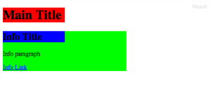
The CSS sets the #site-title element to 30% and the #container-info to 60%. Since they have no parent-level elements with a defined width, they are relative to the document’s width. The document’s width is dynamic and relative the dimensions of the browser window. Within #container-info we set the h1 tag to 50%. Its parent level element is #container-info, so its width is 50% of that element. In the context of the document width, it’s 50% of 60%, which is 30%; the same as our #site-title.
The math behind the above code shouldn’t be too surprising, 0.6 * 0.5 = 0.3.
What about height?
While height can use percents as well, its default value isn’t what you might expect. If we take our width example css and change it to height, you might expect the inverse. Lets try it.
#site-title{
background-color: #ff0000;
height: 30%;
}

#container-info{
background-color: #00ff00;
height: 60%;
}

#container-info h1{
background-color: #0000ff;
height: 50%;
}
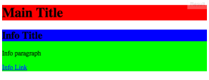
As you can see, its a big pile of nothing. Height still follows the same rules that apply to width, so you might ask why is it not rendering as the height of the browser? In our example, the top level parent is the body tag. Everything styled should be a child of that element. The body tag’s width is relative to the window size and height is, by default, defined by its content. Without a defined value, percentages don’t work. For height we have to have a defined value for our percentage to be based on. So if we apply this to our example, we can see how it works.
#site-title{
background-color: #ff0000;
width: 30%;
height:50%;
}

#container-info{
background-color: #00ff00;
width: 60%;
height: 300px;
}

#container-info h1{
background-color: #0000ff;
width: 50%;
height: 50%;
}
jsfiddle Example 3
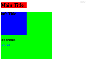
For #site-title, we’ve set the height to be 50%. Since our body doesn’t have a defined height, it’s basically a worthless line of code. If we look at #container-info, we’ve set its height to be 300px. Now, its children will have a real value to work with. To see height percentages working as expected, we’ll set #container-info h1 to 50% height. With its parent having a height of 300px, 50% of that sets the element to a height of 150px.
I’ll admit, height percentages are not used often. However, combined with media queries, it can be very helpful. You now only would have to change the parent pixel value in one query and all your corresponding percentage heights will scale! A very valuable piece of information, but we’ll save media queries for another post.
Odds and Ends :
With those basics on height and width, you can start to build out virtually any layout. I won’t go through all the ways you might have to position your elements using percentages, but I’ll provide a few examples of styling that might be helpful. We’ll be walking through the following CSS:
#site-title{
background-color: #ff0000;
width: 90%;
text-align: center;
margin: 0 auto;
}

#container-info{
background-color: #00ff00;
width: 90%;
margin: 0 auto;
}

#container-info h1{
background-color: #0000ff;
}

#container-info div{
overflow: auto;
}

#container-info p{
width:50%;
color: #fff;
background-color: #000;
float:left;
}

#container-info a{
width:40%;
margin: 0 5%;
color: #fff;
background-color: #333;
float:right;
}
jsfiddle Example 4
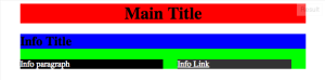
There are a few basic things that we’ll extract from this CSS that percentages want to leverage.
Centering: Its not much different than how you would center an element normally. Just apply margin: 0 auto; like we would normally to a block element. Most mobile designs will have a balanced gutter on both sides. The best way to accomplish this is to set the element’s width to an even number, in our example #container-info has a width of 90% with the margin set to auto. Now all the content in the parent container is centered with some spacing of 5% on each side.
Sections: With percentages, we can create sections within our parent element to break up content. If we look at #container-info, we see that we’ve set the container to have overflow: auto. This allows us to create elements inside that container, and apply the float value, while having the #container-info element not lose its height. Once that’s set, we can float our p tag left and a tag right. With the widths set to numbers adding up to 90%, we have them fit perfectly inside the container. This is very useful in layout design to have your elements expand and contract with the screen size’s width.
Percent Margin: Creating margins with percents allow for spacing between elements that scale with your design. In our example, #container-info a has a width of 40% and a margin-left / margin-right of 5% with our p tag at 50%. Total that’s 5+5+40+50= 100% of the container width, a perfect fit. Keep in mind, this also works for padding as well, and it will also add the total width.
Percents are an important part of web development, making your site tight and responsive. It may feel daunting at first, but once you understand the basics the time you will save in pixel pushing and restructuring is well worth the time invested.